i found some articles that states what bad design is.
What makes this bad design?
- No visual hierarchy. I can’t tell where to look. There is too much going on that is distracting and unclear. There are too many dominating elements.
- Not Aesthetic. This is the perfect example of a design that’s both unappealing and not functional. The background is loud and takes away from the functionality and the goal of the website which is to direct students to resources.
- Lacking Visual Direction. I am confused on where to direct my focus. Is it the flashing background? Is it the image that I cannot read? Is it the red address at the top of the screen? Or is it the Ad-like pop-up boxes that appear at the very top?
- Space, Alignment, and Pattern. Space is important because it allows the user to clearly be able to navigate throughout the website. However, in this example, space and alignment are unbalanced. All of the information is clumped into a section, and there is no form pattern.
Information overload
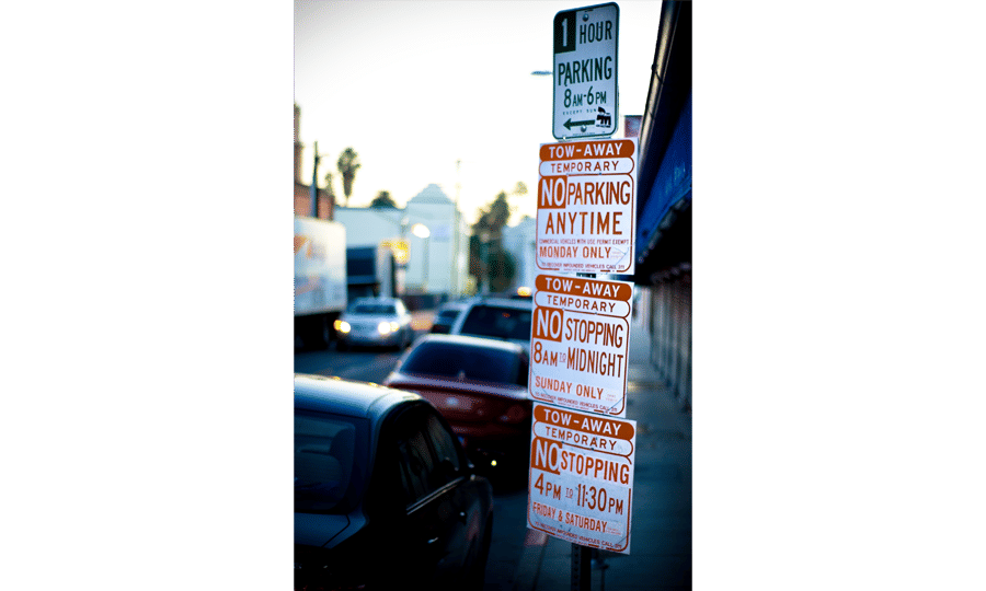
The Bad: Parking Signs in Los Angeles
Parking signs in Los Angeles (LA) have been the epitome of for decades. They’ve always been notoriously hard to understand, because the traffic rules are complex, resulting in the need to convey a lot of information in a small area.
How confusing are these signs? Traditionally, very—look at this example from the 2010s:
- Understand what your users need, then deliver that information.
- If you’ve got lots of information to convey, try using visuals instead of text.
- Always label your links! Users don’t like mystery links.
- Avoid adding any kind of friction to user actions, unless they’re meant to dissuade the action.
- Test your clever designs and include them cautiously.
- Animation is like cursing. If you overuse it, it loses all its impact
I've also taken a look around and found some questionable designs around in leeds


just on my walk home I was able to find several wuatuionable uses of both type image and colour in different formats. mix between physical and digital art some of which has been over produces such as the karaoke one. The advertisements and post is found across Leeds mostly have one thing in common which is a bad mix of typefaces and all it being outlined . Another version of it it's just bad Photoshop jobs essentially but as well bad kerning and just misplaced type i found that it's it's quite difficult to pick apart the main part is that it seems like it's been made in Word with half of it And where it looks alright it's always surrounded by lots of other advertisements so it's all lost . There's no sense to the way that it's been laid out the only thing is that the signs are level that's about the only good thing about him and it was only because of this project that I've noticed them coz I've been looking out for bad designs so they're not even effective in terms of designs or signs.
No comments:
Post a Comment